Search the Community
Showing results for tags 'logo'.
-
-
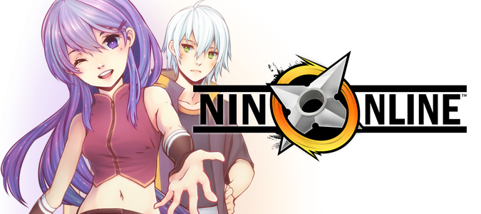
Dear Ninjas, I'm proud to announce that I have finally put the well deserved time into a task that has been on my mind for the longest time ever. Ever since our re-launch in 2013, I had been very, very disappointed with the quality of the Nin Online logo. I had a strong concept behind the design, but rushed the execution so much that it was still a sketchy draft piece when I announced the project back then. Our logo has since been on all our official content, our forums, advertisements and even the game itself! I think we can all agree that the logo is something you look at today and instantly recognize our game and community. So I decided not to stray for from it, but to create a more visually refined and appealing revamp of it. WIth out further ado, here is our new logo! Updated Logo Design The signature shuriken has been refined and re-angled with a corrected perspective, while retaining the most interesting features about it. The circle which is the "O" in Online, has been given a dynamic whirl to it to retain the dynamism present in the previous design while having a more simplified color shading. Here is a visual journey of our logo design changes since the first ever logo in 2007, the first edition of Nin Online. History of Logos of Nin Online We hope that you will hold our logo even prouder in your signatures and when spreading the word of our project here and elsewhere from now on. Regards, Rory
- 18 replies
-
- 11
-

 HITSPARK

